


Lorde Music Video Analysis
- delfinastevens
- Jan 16, 2022
- 2 min read
Lorde for a long time produced music which was very popular, but a few years ago she stopped and 9 months ago she released a song called Solar Power which was a big contrast between her old work and her new one. At the start of the project I was concerned since Lorde is very simple and monochromatic with her work, but now that she released Solar Power my work can relate better to it.
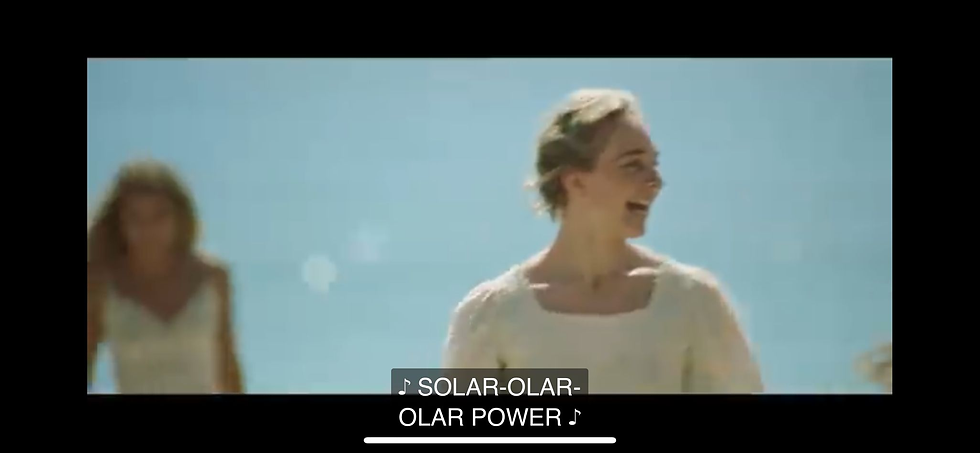
Here is a contrast picture between Royals music video and Solar Power music video:


So as you can see her oldest work doesn’t fit with my project idea, her new video is very colourful and includes a lot of green/yellow/white which are some colours I want to feature in my music video. In this music video she makes it very joyful and upbeat and features people laughing which is something I want to stand out in my video.

I was a bit nervous to think that my idea for the music video wasn't going to fit at all with her music but since she released Solar Power I feel more confident about my use of colour and theme. I'm also taking a lot of inspiration from the 70s and 90s and when I saw Lorde's social media page I noticed she uses 70's inspo as well, specifically in her tipography and colour selection.

She uses lot's of brown and yellow which remind me to beach colours (just like her music video), it also shows the purity and simplicity of her music.
I also found her poster by scrolling down. This poster reminds me of a festival in the desert, very 70's. Another thing in common is that she uses a lot of red which I will too because of symbolism (love, passion... etc)


Comments